Tech giant Meta has officially unveiled the new logo for the Instagram platform, marking its first visual change in the past ten years. Instagram head Adam Mosseri announced the change to the wordmark in a post, explaining that the old style had not changed in a decade. According to him, the version […]
Instagram changes its logo after 10 years
Tech giant Meta has officially unveiled the new logo for the Instagram platform, marking its first visual change in the past ten years.
Instagram head Adam Mosseri announced the change to the wordmark in a post, explaining that the old style had not changed in a decade.
According to him, the new version is cleaner and more modern, while retaining the simplicity and artistic elements that have always characterized the app.
Meanwhile, the other icons, including the one for the camera in various colors, have remained unchanged.
However, critical reactions and jokes on social media were not long in coming.
Many users immediately noticed that the letter “r” in the new stylized logo bears a slight resemblance to the letters “z” or “u”, while the letter “s” looks like an “a”.
This led commenters to joke that the new name could be read as “Instagzam”, “Instagwam” (as a small child might pronounce it), or even “Instaguam”.
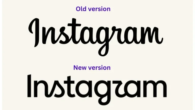
Others criticized the practical aspects of the design, arguing that the new logo is difficult to read and does not meet accessibility standards.
In addition to criticizing the design, many users took the change as an opportunity to voice their dissatisfaction with bigger problems on the platform, including the lack of filters for AI-generated content and the large number of fake profiles (bots).
Large accounts with millions of followers urged Mosseri to focus on supporting content creators and addressing the issue of accounts being shut down without official explanations, rather than making visual changes.
Related

Technology
GTA 6 is launching this week, here are the date and details you need to know

Technology
YouTube, Facebook or TikTok? Here’s which social network Americans use most

Technology
Microsoft says its services have fully recovered after a day-long global outage
Technology
Microsoft outage paralyzes businesses, schools and government institutions around the world
Technology
Microsoft Platforms Face a Global Outage

Technology
Robot Takes on Humans in Antarctica Marathon, but Gives Up After 3 Kilometers
Technology
Google will add a dictionary to Gboard that saves words corrected during voice dictation

Technology
WhatsApp introduces “Events Home,” making it easier to organize get-togethers

Technology
Honda puts revolutionary V3 engine into production
Technology
WhatsApp tests a new feature

Technology
DokuTech 13, Kurti: Technology, the most dynamic sector of the economy
Technology
Windows 11 Gets Significantly Faster